
Originally published on Golden Pin Design Award website.
閱讀中文版
With a plethora of traditional Chinese fonts available on the market—KaiTi, SimHei, FangSong, MingLiU, and Jin Xuan, just to name a few—it would seem as if the realm of available fonts leaves little to be desired.“Taiwan Road Font” proves otherwise, after scooping up the 2018 Golden Pin Concept Design award. The visionary behind the new font, Tom Liou, could hardly contain his excitement as his font received public recognition for the first time, crying out, “No way! I can’t believe it!”. Liou has a rather comedic personality, but, as a student, always felt as if he lagged behind everyone else. Besides a genuine interest in font design, he was also motivated by the chance to prove himself—and, even more importantly, to create something that would benefit society.

Tom Liou is a UI designer in his early thirties working at NUWA Robotics, a robotics start-up. With a hectic 9 to 9 work schedule, he can only find time to work on his font over the weekend. Tom’s original inspiration to design a font was set in motion back in 2016, when Taipei was named World Design Capital. Tom recalls, “I was working at a printing house, and would print huge stacks of unattractive promotional materials all day. At the same time, many designers were spontaneously improving on existing designs, such as recreating signboards or even redesigning the overall look and feel of some of Taipei’s MRT stations. The more I saw, the more I wanted to be like these designers, and do something for society”.

While he was working at the printing house, he also discovered a common flaw in the way promotional materials were designed. Usually, the paper layout would be quite small and completely over-stuffed with information, causing the font to squish together in a visually jarring manner. That sparked an idea, “An elongated font would occupy just half the space, but with a much more aesthetically appealing effect”. Additionally, as he rode his scooter through the streets, he noticed the painted road signs—such as, “Stop”, “Slow”, “No Motorcycles”—were also written in an elongated script. In a stroke of inspiration, he thought, “Why not design a long and narrow font for the painted road signs?” Thus kicked off the early planning stages for “Taiwan Road Font”.
However, he failed to realize that other ‘road fonts’ already existed in places like Japan and Hong Kong, as founder of the Facebook group “字嗨”, He Zhi-Jie, reminded him. While he became somewhat discouraged after hearing this, he found new motivation thanks to encouragement from his JustFont teacher, Guo-Rong Zeng, who made the point that just because something had been done before, doesn’t mean it can’t be done again—the most important thing is creating something that is distinctly Taiwanese. Reinvigorated, he began collecting data, both interviewing road sign painters and also taking pictures of existing road signs all over the city. He recalls, “I would sometimes climb up onto the median strip on bridges to take pictures. All the cars driving by must have thought I was a total lunatic! Although I would sometimes feel lonely, or feel sorry for myself, all I would need to do is remember that I was following my passion, and any regrets would immediately disappear.”
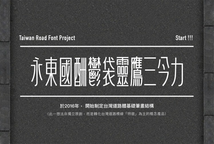
With tens of thousands of unique characters, designing a Chinese font is no easy task, but Tom shared some insider’s tips about how to get started. The first step is perfecting the design of a select group of characters — 永東國酬鬱袋靈鷹上下今 — which contain a representative sample of the strokes and shapes found in the entire Chinese script. For example, square-shaped characters (國), diamond-shaped characters (今), and characters containing the outline of a triangle (上, 下) can be represented with just those four characters. For character proportions, start with 東, with a 口 at the center—which can help determine whether the font needs to be compressed or widened. To ensure characters with many strokes appear balanced, start with vertical stroke-heavy 酬, horizontal stroke-heavy 鷹, and 鬱, the Chinese character with the most number of strokes. By designing a representative group of characters, you create guidelines that can be applied to all other characters going forward.
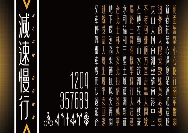
As of today—two years later—Tom has already designed over 580 characters. The biggest challenge so far? “Creating something from nothing”. Even though he knows what road signs currently exist due his extensive research, he needs to extrapolate on his findings to figure out with what may exist in the future. Additionally, he is constantly changing his mind, and is frequently dissatisfied with his original guidelines. Even the slightest adjustment on these guidelines causes a domino effect, whereby other characters that were previously “finished” also need to be re-adjusted. He admits, “Designing a font isn’t as easy as I thought it would be! I think the truly difficult part is only just beginning.”
Tom revealed that he was also very unsure of himself throughout university; this feeling of inferiority mounted as none of his artistic works had ever won any awards. For him, winning the Golden Pin Concept Design Award was a long-awaited recognition of his ability. Not only that, his Facebook group “大小設計” already has over 6000 followers, and he has started to attract at-tention from the media—he feels like he’s living the dream! “My design isn’t the most beautiful, but it is applicable to daily life. It feels “localized”—that’s probably what attracted the judges’ attention.” He is also encouraging others to enter the competition. “Just because you never won any awards at school, it doesn’t mean your designs were bad. As long as you are willing to invest your spare time into designing what you’re passionate about—you can hold onto the belief that someday you will be recognized for your work.” Entering the Golden Pin Concept Design Award is the best way to drive momentum and give you a short-term goal to work towards. Today, Tom’s biggest ambition is to transform his “art” into a “product” and make it available on the market. Smiling, he said, “Actually, the best thing about winning the award was forcing myself to finish it and stop being lazy”.
