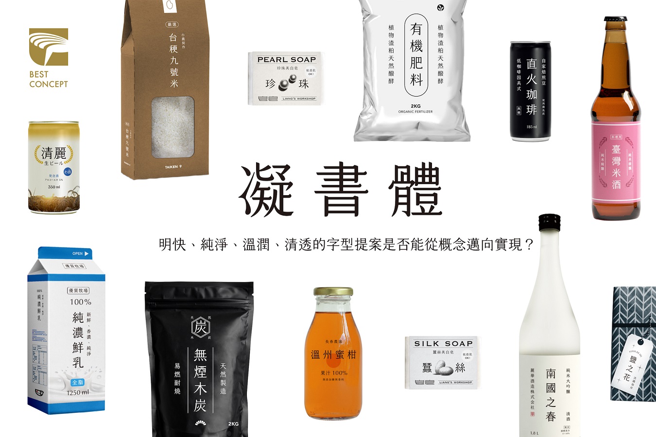
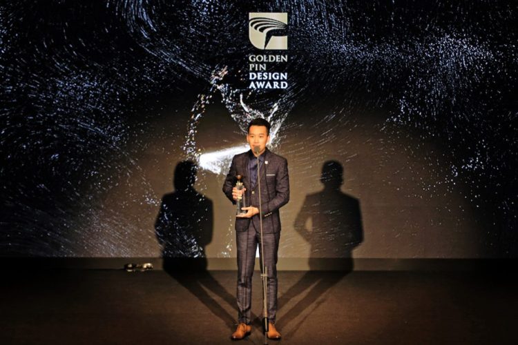
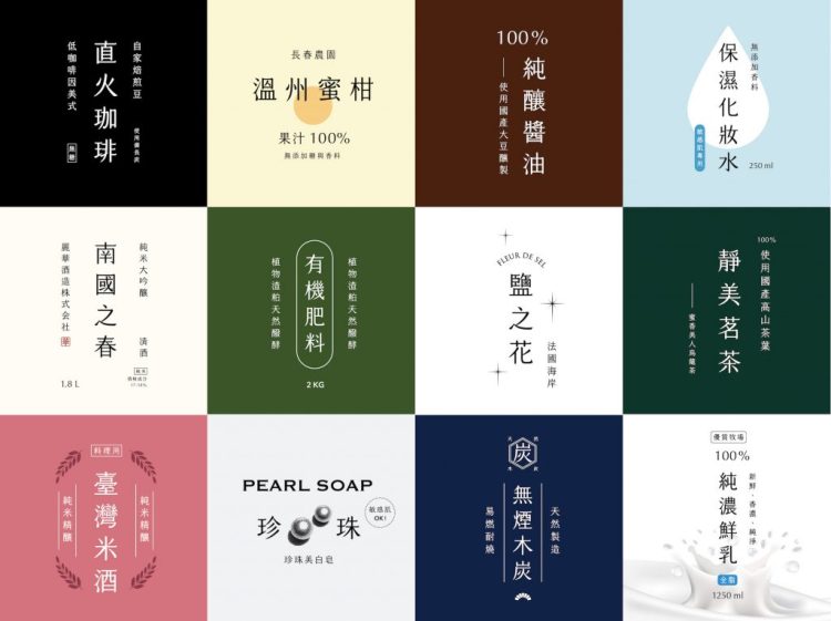
Taiwanese graphic designer, Bo-Han Shih, created a clean and elegant new font to add variety to the dismal number of Chinese fonts currently available in the market. The square-shaped font displays an elevated level of gravity, with the strokes of each character condensed inwards. A slight uptick at the end of each horizontal stroke resembles a dollop of whipped cream. This distinctive characteristic inspired the ‘Cream Mincho’ name, and set this innovative new font apart from the rest—rising above 4,400 other entrants to win Best Design in the “2017 Golden Pin Concept Design Award”. One of the 2017 GPDA judges, Effie Huang, the director of the EHS Design Group, praised the ‘Cream Mincho’ font for “igniting a warm, nostalgic feeling, and evoking a sense of calm.” Going forward, Cream Mincho will be renewing its look to re-emerge as ‘Cream Font’, with plans to start.

This piece was originally published on the Taiwan Design Center’s website, in English and Chinese.
